Research Session: What's up with Wine Labels?
The world of wine is complex and ever changing. For roughly 8,000 years, humans have been drinking some sort of fermented grape juice. Today, close to 30 billion bottles of wine are produced worldwide every year. That's a lot of juice.
Beyond my work in product at Citizen Codex, I've spent years studying wine, which eventually led me to work as a sommelier in my local city. That side quest has given me a chance to combine my design and product background with my interest in the world of wine, and this month's Research Session was the perfect excuse to do exactly that.
Why wine labels?
These simple pieces of paper carry the brunt of the winemaking process's public face. All the consumer sees is a small label trying to express all of those decisions at once, while also following the law. In a lot of ways, the label is an interface: a tiny, heavily regulated piece of design sitting between a very complicated system and a regular person trying to pick a bottle for dinner. That's a problem we think about a lot at Citizen Codex: turning complex data into something people can actually consume and act on, just usually without the Pinot Noir.
How I did it
First, I needed labels. I scraped two retailers, Wine.com and the natural wine shop Leon & Son, for just over 12,000 label photos (red and white only). Fun side note: figuring out when the same wine showed up at both shops became its own matching puzzle, a nice callback to Matter of Matching.
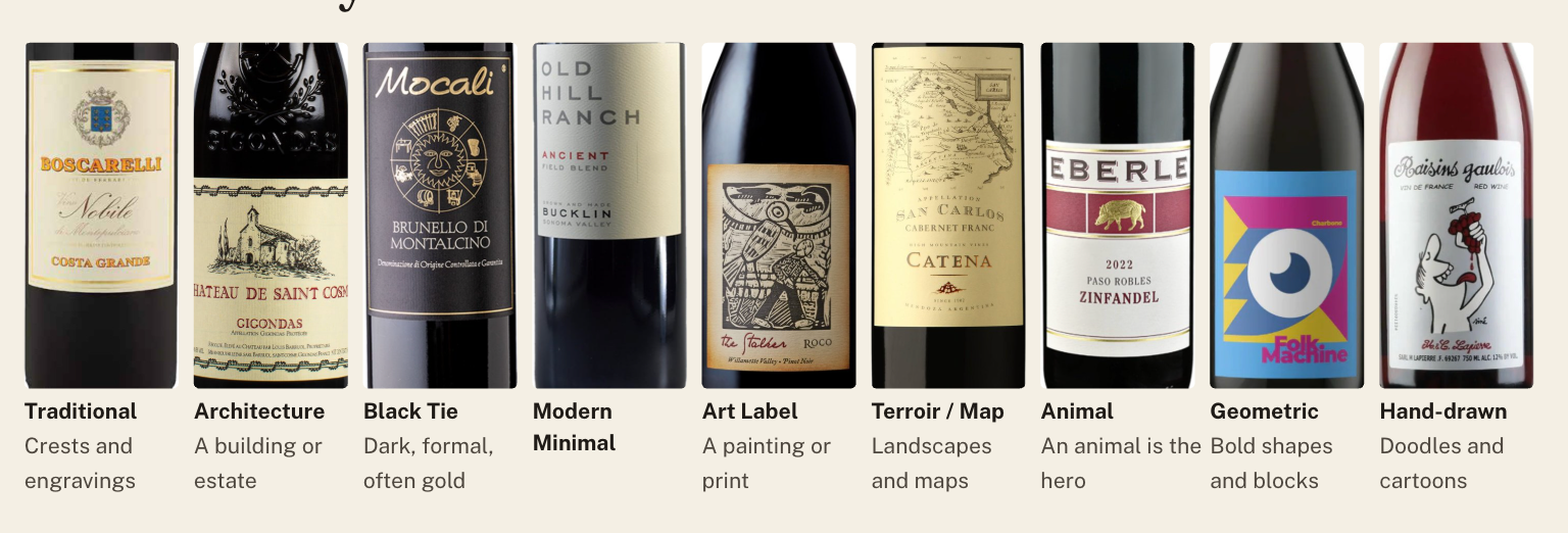
In the end (and for the sake of time) I built consensus with myself, the sommelier, and had AI apply my rules to every label. It agreed with me about 70% of the time, better than we humans managed with each other. I also added a simple 1 to 5 scale from Traditional to Modern, which was much easier to track and took some of the subjectivity out.
What the labels showed
Labels group by place, not by style
With the results in a spreadsheet, I built a map of the entire collection. Think of it as a seating chart: each label gets turned into a numeric fingerprint, and labels that look alike get seated next to each other. This let me see how 12,000 labels group visually without telling the computer what to look for.
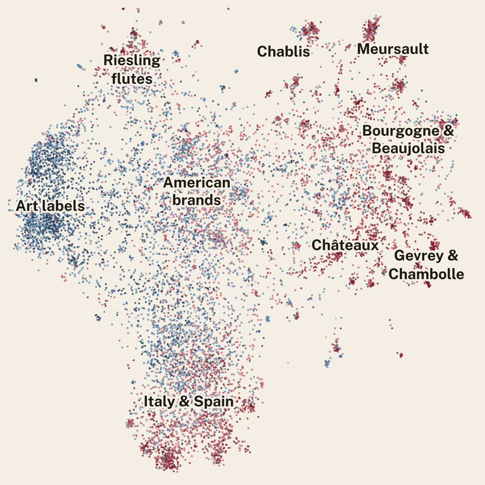
What the map showed was that the common visual themes are mostly geographic: Burgundy, Bordeaux, Spain, and Italy each formed their own neighborhood. American brands sat in the middle, and the more avant-garde art labels clustered off to the left. The pull of place was strong: 93% of Meursaults (a highly regarded region in France known for Chardonnay) landed in the same neighborhood. The art labels were the only group defined by design rather than geography. It was interesting to see that when it came to design and wine, place mattered more than style. In a way, the region defines the design system, and most producers fit within it.
Traditional labels cost more, mostly because of where the wine comes from
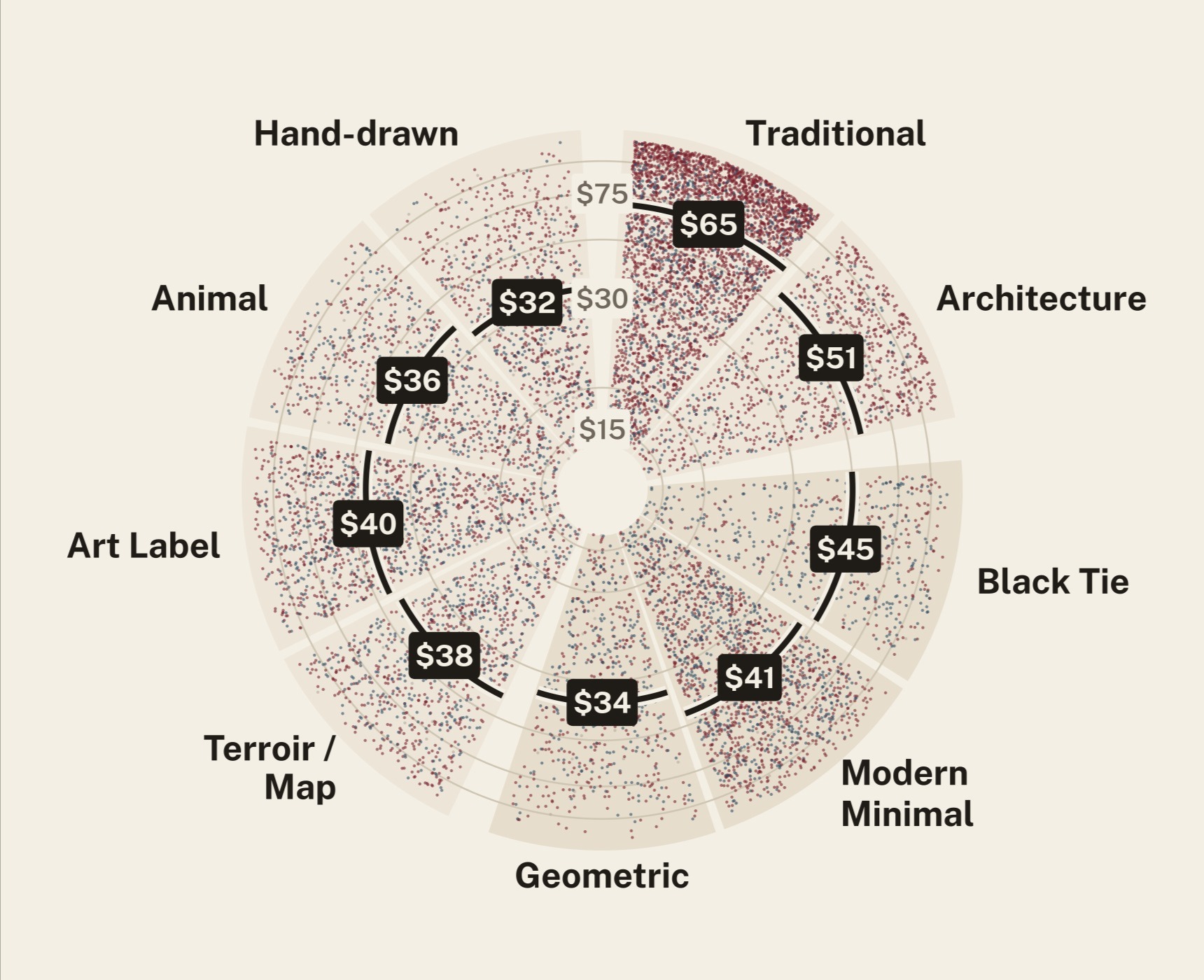
Despite the wonderfully dot-infused map, I yearned for axes. I built a price wheel that plotted every label by price and style. I found that the more traditional a label leans, the more expensive the bottle tends to be (a median of $65 for Traditional versus about $31 for Hand-drawn), while more modern labels show up at both retailers at a cheaper price point. Of the 101 bottles over $1,000 in my dataset, 70% wore traditional labels and nearly all were from traditional regions in Europe.
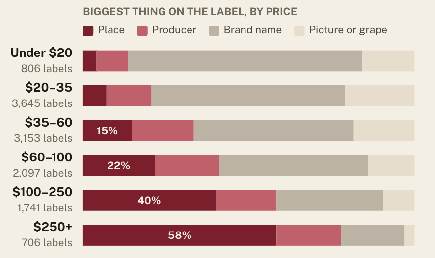
Digging deeper, the price gap is much more about where the wine comes from, not how it's labeled. Comparing wines from the same region (for example two wines from the Napa Valley region) the Hand-drawn discount shrinks from 55% to about 23%. The label isn't setting the price but actually just better signaling the address.
Critics don't seem swayed by the label
Wine, like music or art, is a subjective experience. It's much harder to put a number on quality, since quality changes from person to person. I did not, in fact, taste 12,000 wines and rank them by my personal preferences. Next time.
The closest proxy I had for quality was critic scores on Wine.com, and they told a pretty clear story: once you account for price, label style made almost no difference. Where critics do play favorites is earlier, in deciding which wines get reviewed at all. Think of the pop charts: the big names get reviewed everywhere, while an indie artist fights just to be heard. Prestigious regions are wine’s chart-toppers, and their bottles tend to wear traditional labels, so traditional bottles were more likely to get a review (66% versus 50% for Hand-drawn). Add heavy grade inflation (98.5% of scores were 90 or higher), and ratings make a shaky stand-in for quality.
What I took away
This is a small sample, built mostly around price and visuals. At the end of the day, I was excited to use some real quantitative data to get a clearer picture of what the landscape of wine labels looks like today. Two things stuck with me beyond the wine itself.
First, the hardest part wasn’t the data, it was the categories. Deciding what counts as “traditional” is a judgment call, and the AI can only be as good as the consensus we humans are able to build. That’s true anytime we ask AI to sort the world into buckets: it inherits our disagreements along with our rules.
Second, you can analyze 12,000 labels, but the numbers only take you so far. In wine, almost every data point comes back to a person: someone decided what looks "traditional," someone decided what tastes "good," and someone gave it a specific rating. That's something we wrestle with all the time at Citizen Codex: you may have a corpus of data readily available, but you still have to understand the people behind it.
If anything, I hope you'll take an extra second to peruse the plethora of labels the next time you're in the store picking up a bottle for a dinner party.